Popular posts from this blog
Breanna_TheReflectedSelfie
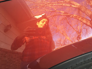
I have to say that this final project has motivated me to try something new with my selfies. I was glad to pick the reflected selfie because of the services, whether curved, vibrant, or multiple reflections of me in one picture. I used my mother's vehicle as a reflection, and I loved how the red tone reflected on the selfie, including the trees in the background. My favorite portrait would have to be me holding the crystal ball and catching my reflection upside down. The multiple reflections were a unique idea because they made me think of the hall of mirrors at the Carnival. I took the other photo at the bookstore, and they have Plexiglas, where you can see my reflection. I used a pizza cutter as a reflection, and I liked how the selfie turned out with the shape of the pizza cutter. Overall this was a fun and unique selfie experience. There are many ways to make a great selfie.


Image 1: Good picture we can clearly see the building but the car and trees block it a little too much. Maybe scooting over and taking the photo would've been better.
ReplyDeleteImage 2: Looks good shows portrait topic nicely. Very symetrical
Image 3: Shows lines clearly just wish you would've angled camera down a little bit more just so we didn't see the top of the building.
Image 4: Good shapes Nice lines with the bars, should've been under the lines topic but works for shapes.
Image 5: Not the best picture to represent color, if we didn't know this was for color then we would be really lost.
Image 6: Really good picture, shows how gradual light to dark is in this picture.
Image 7: Great image just move to the side smoking sign looks bad.
Image 8: Great texture perfect picture for topic.
Image 9: Fits topic wish it was for color topic instead.